Customizing Appearance and Chart Themes
AgencyIQ lets you customize the visual appearance to match your preferences. You can change the overall theme, table density, number format, and chart color palette — all without touching any data.
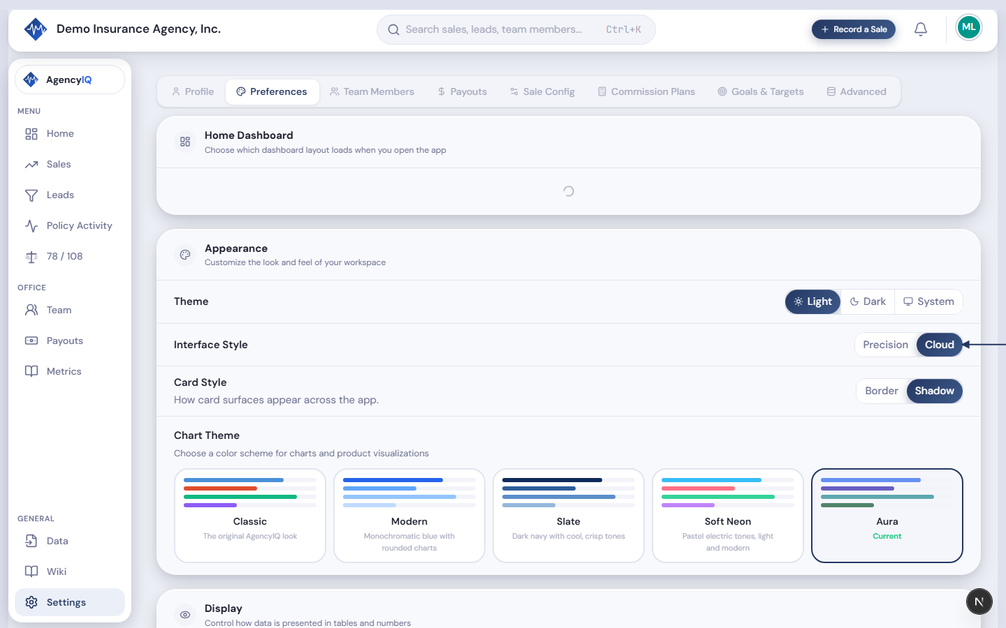
Theme
Open Settings → Preferences to find the theme options. Choose between:
- Light — the default bright appearance with a clean white background. Best for well-lit environments.
- Dark — dark background with light text. Reduces eye strain in low-light environments and looks sleek.
- System — automatically matches your computer's dark/light mode setting. Changes throughout the day if your OS uses a schedule.
Table Density
- Comfortable — more spacing between rows, easier to read at a glance. Good for reviewing data casually.
- Compact — tighter rows showing more data on screen at once. Better when you need to see lots of records without scrolling.
Number Format
Choose how numbers are displayed throughout the dashboard — currency values, percentages, and counts all respect this setting:
- Standard — comma thousands separator, period decimal (1,234.56). Used in the US, UK, and most English-speaking countries.
- European — period thousands separator, comma decimal (1.234,56). Used in Germany, France, Spain, and most of Continental Europe.
- Indian — lakh grouping with comma separator (1,23,456.78). Used in India and South Asia.
- Minimal — no thousands separator (1234.56). Clean and compact.
This affects every formatted number across the app: KPI cards, chart tooltips, table cells, and reports.
Chart Themes
The chart theme controls the color palette used in every chart and data visualization across the entire app. Choose from:
- Classic — the original AgencyIQ look with bold, distinct colors for each product line
- Modern — clean blue tones with a professional, understated feel
- Slate — dark navy palette with cool tones for a sophisticated look
- Soft Neon — pastel electric tones with sky blue, salmon pink, mint green, and lavender
Tip. Try different chart themes to find what's easiest to read at a glance. Some people find high-contrast themes better for quick scanning, while others prefer softer tones for extended use.
Last updated: 2026-04-22